| species | island | bill_length_mm | bill_depth_mm | flipper_length_mm | body_mass_g | sex | year |
|---|---|---|---|---|---|---|---|
| Chinstrap | Dream | 50.0 | 19.5 | 196 | 3900 | male | 2007 |
| Chinstrap | Dream | 51.3 | 19.2 | 193 | 3650 | male | 2007 |
| Chinstrap | Dream | 52.7 | 19.8 | 197 | 3725 | male | 2007 |
3 Scatterplots and Correlation
3.1 Relationships
Explanatory and Response Variables
- Response: Responds to the explanatory variable.
- Also called dependent variable.
- Explanatory: Explains the response variable.
- Also called independent variable.
Knowledge about explanatory tells us about the response.
- We are not assuming the explanatory causes the response. We will not be covering causality in this course.
- We are discovering tendencies, not rules.
I just want to make this very clear: we are not looking for a causation. Instead, we’re just looking at whether or not to variables are related, and we think that measurements of one will be enough to tell us about measurements of the other. For example, if we think one variable is easy to measure and another is harder to measure, then we might want to set the easy to measure variable as the explanatory variable and see if it “explains” the harder to measure variable. This has nothing to do with the easy to measure variable causing the hard to measure one.
Examples
- Blood alcohol content affects reflex time. – Some individuals may be more or less affected.
- Smoking cigarettes is associated with increased risk of lung cancer, and mortality. – Some heavy smokers may live to age 90
- As height increases, weight tends to increase.
- Height does cause weight, but there are other explanations.
In these examples, we carefully use words like “affects”, “associated with”, and “tends to”. For all of these examples we would expect a relationship of some sort, but the causality is not necessarily obvious.
We obviously expect the blood alcohol contact to affect reflex time. We expect this to be a causal relationship.
In the mid-1900s, it was hypothesized by cigarette companies that, rather than cigarettes causing cancer, people who were at increased risk of lung cancer with the sorts of people who also tended to smoke. Finding a relationship was not enough to convince people that it was cigarettes causing lung cancer. Even though we know that there’s a relationship between cigarettes and lung cancer, the techniques we learn in this course are not enough to conclude causality.
Height and weight are an example of how are the knowledge of one variable tells us about the other, without there being any causal relationship. We expect that taller people will have more mass, but there are also other reasons why somebody might have more mass that or not captured by their height.
3.2 Scatterplots
Example
- One penguin has a flipper length of 193.
- That same penguin has a body mass of 3650.
- Both measurements were made on the same individual.
- Individual: thing we are making measurements on.
- Each value on the x-axis is paired with a value on the y-axis.
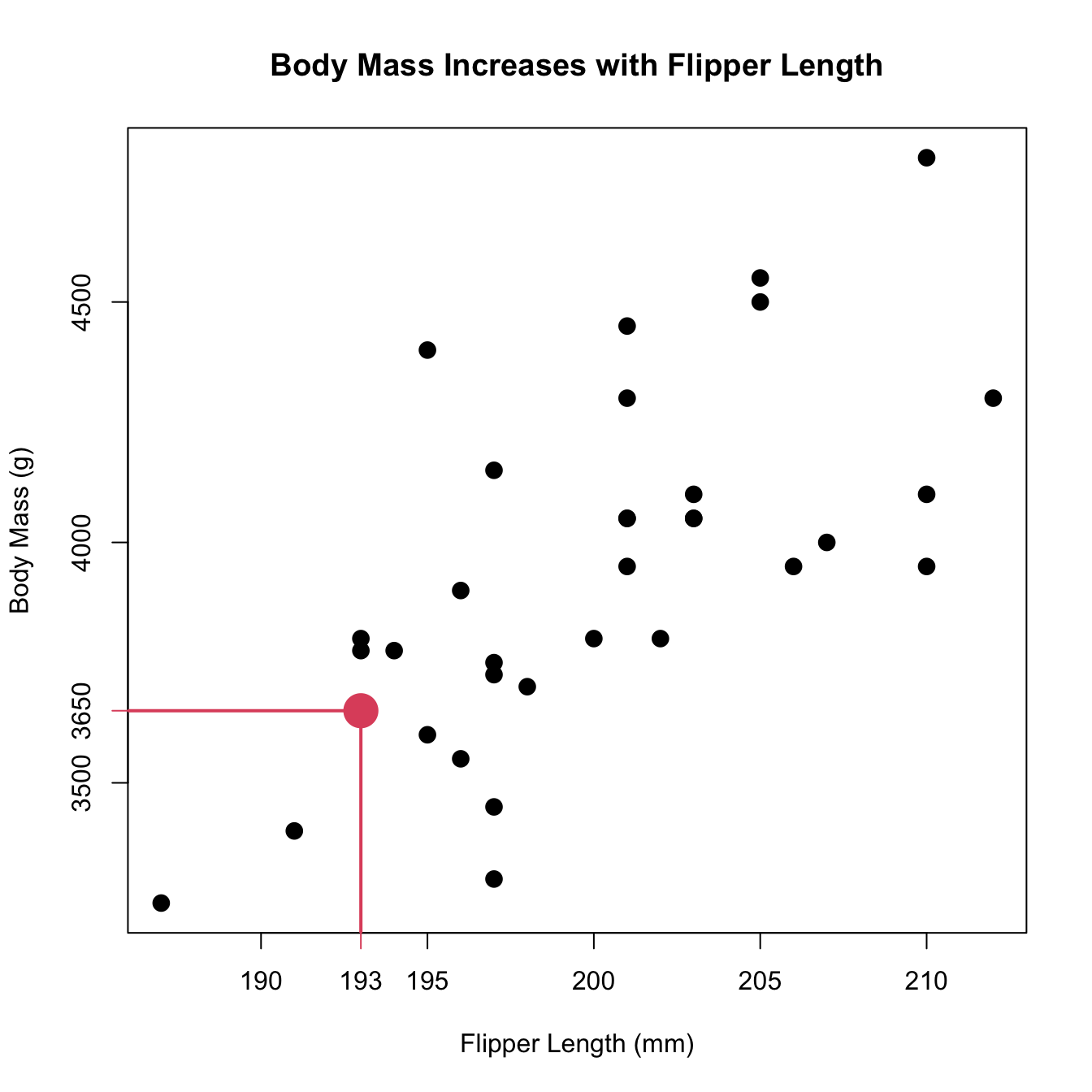
In the plot above, each individual has multiple measurements recorded on them. Because of this, we can plot each pair as a point in the plot. Note that we need to know which x-value is associated with each y-value in order to make the plot!
What to look for
- Overall pattern
- Linear, curved, etc.
- Direction (increasing/positive, decreasing/negative)
- Constant variability
- Deviations from the pattern
- E.g., linear only in a small range
- Outliers
- As before, discuss outliers separately from the pattern.
In general for this course were looking for a linear pattern. There are other models out there that fit nonlinear patterns, but we do not cover them in this course. There’s one way for things to be linear, and there are an infinite number of ways for things to be nonlinear. However, there are many common ways to account for non-linearity while still using a linear model.
Regardless of whether something is linear or has some sort of curve, we are very interested in how strong of a pattern there is. For a linear model this means we want the points to be very close to the line, whereas for non-linear models we want the pattern to be very clear. We generally want patterns to pass the “facial impact test”, were the pattern is so obvious that it might as well be slapping you in the face (this is not an official test).
As with describing the shape of histograms, we treat outliers as something that are not part of the shape. We can have a clear linear pattern that happens to have an outlier.
Penguins!
What pattern is this?
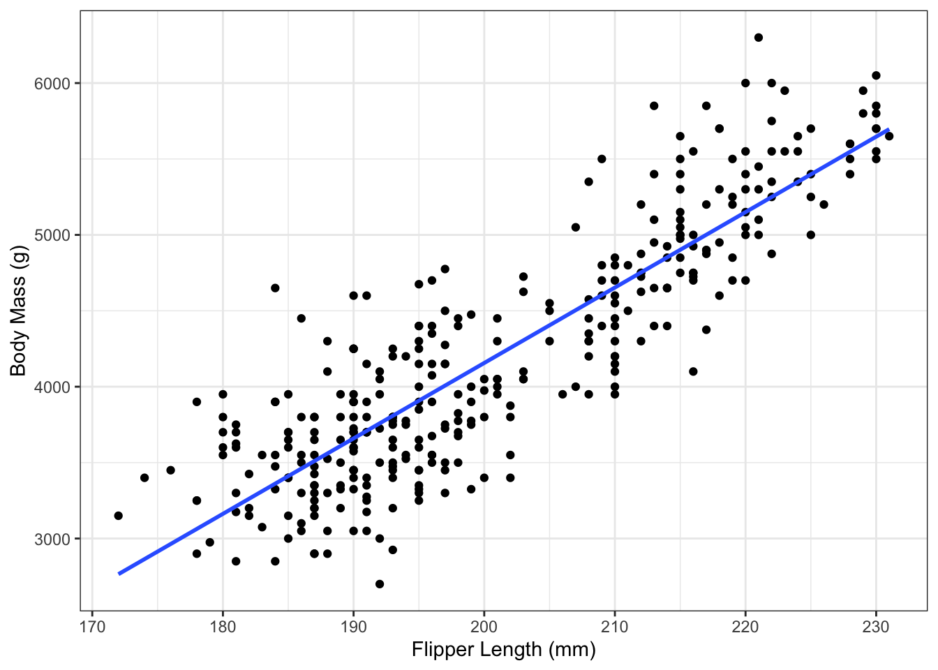
The plot above shows a clear linear pattern. There is still some variation above and below the lines, but the pattern is still clear. It kinda looks like there may be two clusters; there’s a space between the two groups in the center of the X axis.
Adding a Categorical Variable
Each point has an \(x\) coordinate, \(y\) coordinate, and some other information. We can encode that information with a colour! Again, we have to have a categorical variable measured on the same individual as the x and y values.
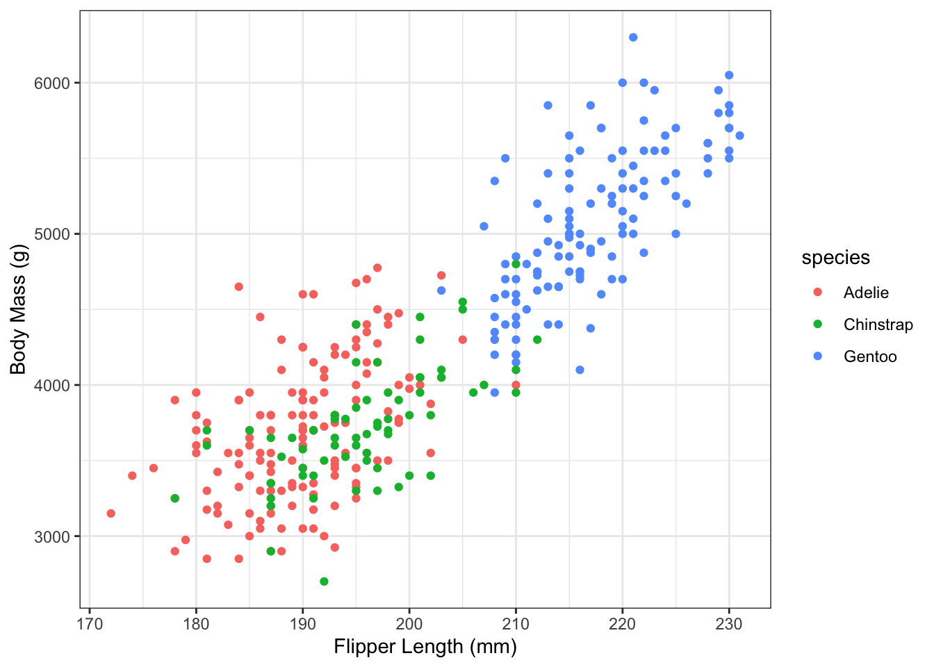
From this plot, we can see that the three species in these data all have a similar relationship, but still it might be worth separating out the groups and seeing what happens!
Bonus question: the first plot of body mass versus flipper length only showed one species. Can you tell which species?
The Importance of Plotting: Anscombe’s Quartet
| variable | mean | sd |
|---|---|---|
| x1 | 9.000000 | 3.316625 |
| x2 | 9.000000 | 3.316625 |
| x3 | 9.000000 | 3.316625 |
| x4 | 9.000000 | 3.316625 |
| y1 | 7.500909 | 2.031568 |
| y2 | 7.500909 | 2.031657 |
| y3 | 7.500000 | 2.030424 |
| y4 | 7.500909 | 2.030578 |
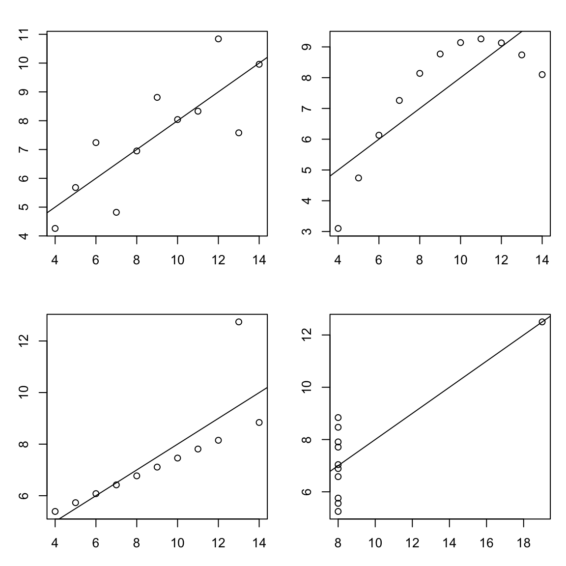
In this course we’re introducing plots before we talk about numerical summaries of two variables for a very good reason. The table above shows summary statistics from a well-known data set called Anscombes quartet. Up to the first two decimal places, all of the variables in the data have the same mean and standard deviation. If this were all of the information you had, you might expect the plots of y1 versus x1, y2 versus x2, y3 versus x3, and y4 versus x4 to look similar.
Instead, they look like this:
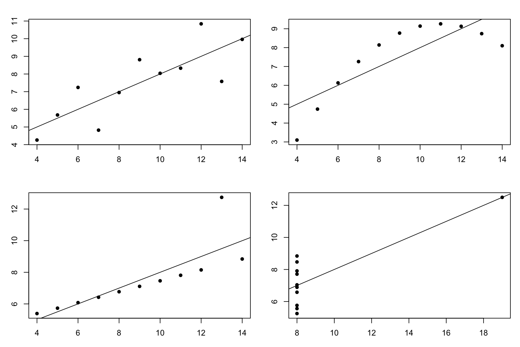
Clearly, there’s a very different pattern in each plot.
- The first plot looks relatively linear with a little bit of random variation. For this data set a linear model does seem appropriate.
- The plot at the top right she was a very clear pattern that is not linear, so we may be able to fit a model that accounts for this non-linearity.
- The plot at the bottom left is almost a perfect line, but with an outlier. This outlier makes it so that the line that I have added to the plot doesn’t actually go through the perfect pattern that we can see if that outlier weren’t there.
- The bottom right plot is a mess. If it weren’t for the outlier, the X values would all be identical! In this case, a scatterplot would not be appropriate. If I saw this while analysing my data, I would have assumed that X was supposed to be either constant (e.g., all X values should have been 8) or categorical. In both cases, a scatterplot would not be appropriate.
Despite all of these wildly different shapes, all of these data sets have the same summary statistics.
Plot. Your. Data.
Summarizing Plots
- Each data point has an \(x\) and a \(y\). We plot \(y\) against \(x\).
- \(y\) is the response, \(x\) is the explanatory variable.
- We’re looking to see if it’s linear. Linear models are something we know how to deal with!
- Deviations from linearity are noteworthy.
- Outliers are noteworthy.
- We can incorporate more information in a scatterplot, especially categorical variables.
3.3 Summary Statistics for Two Continuous Variables
Measuring Strength of Linearity
From plots, we can sorta see that one looks more linear than another.
It would be splendid if we could have a way to quantify this…
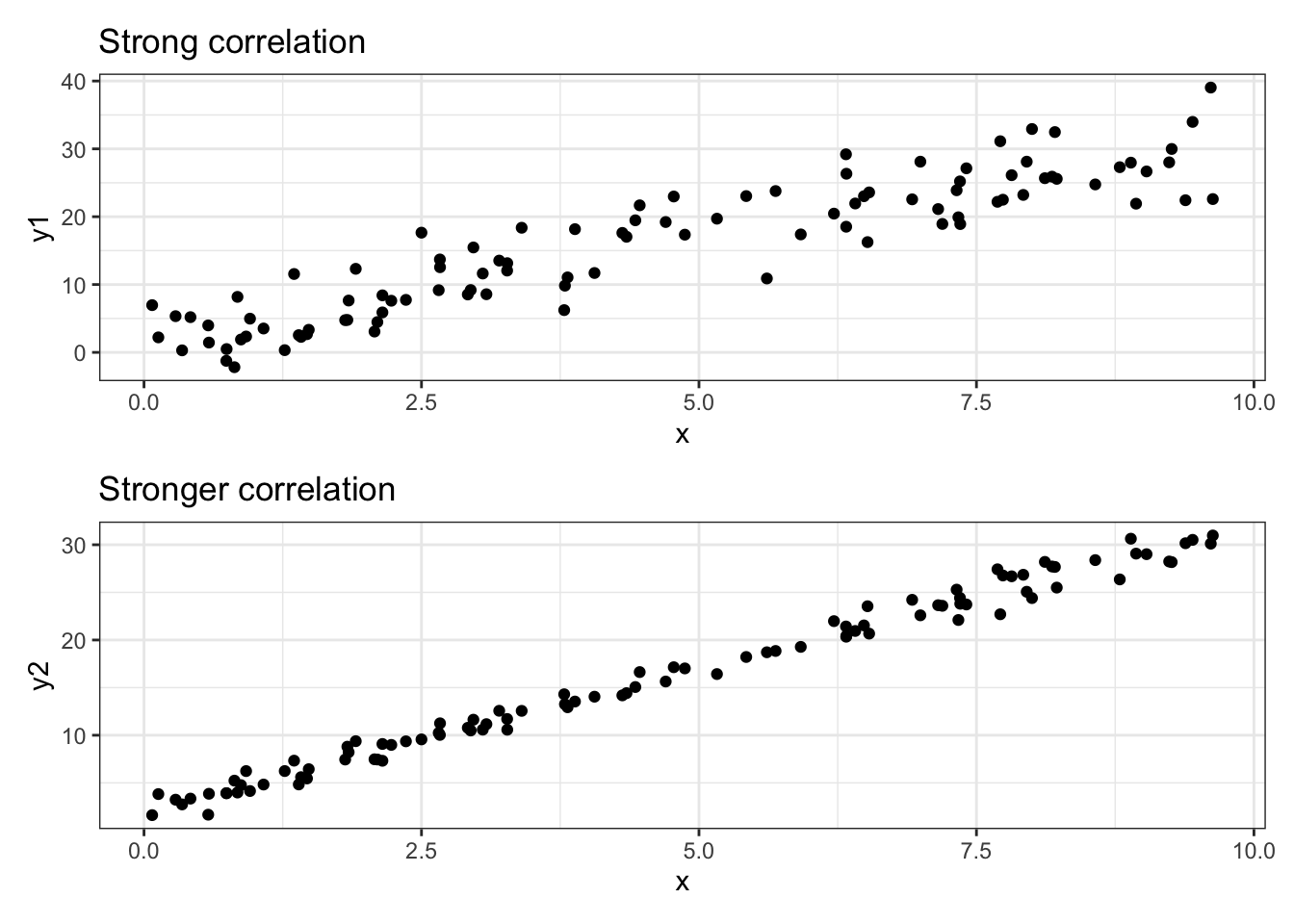
From this point on, we’re focusing on linear relationships. The plots above both demonstrate the same linear relationship, but with different “strength”s. Let’s measure that!
The correlation coefficient \(r\)
Recall the formula for the variance: \[ s_x^2 = \frac{1}{n-1}\sum_{i=1}^n(x_i - \bar x)^2 = \frac{1}{n-1}\sum_{i=1}^n(x_i - \bar x)(x_i - \bar x) \]
The correlation coefficient is defined as: \[ r = \frac{1}{n-1}\sum_{i=1}^n\left(\frac{x_i - \bar x}{s_x}\right)\left(\frac{y_i - \bar y}{s_y}\right) \] where \(s_x\) is the s.d. of \(x\) and \(s_y\) is the s.d. of \(y\).
It’s like a variance for two variables at once!
This explanation might not stick for those of you who aren’t a fan of formulas, but I think this demonstrates an important aspect of the correlation coefficient. The formula for the standard deviation includes \((x_i - \bar x)(x_i - \bar x)\). If we replaced one of those with \(y\), we’d get \((x_i - \bar x)(y_i - \bar y)\), which is one step closer to the correlation coefficient. In other words, the correlation is a measure of how two (quantitative) variables vary together! Correlation is an extension of variance!
Let’s try another approach. \(x\) has variance. \(y\) has variance. They also have variance with each other. This is measured by the correlation!
If neither of these explanations make sense, don’t worry! We’ll see plenty of correlations and get an intuition for how correlations are different with different data.
The range of \(r\)
\[ r = \frac{1}{n-1}\sum_{i=1}^n\left(\frac{x_i - \bar x}{s_x}\right)\left(\frac{y_i - \bar y}{s_y}\right) \]
- \(s_x\) and \(s_y\) are positive
- \(s_x > \sum_{i=1}^n(x_i - \bar x)\), similar for \(s_y\)
- The correlation coefficient cannot be larger than 1
- \(x_i - \bar x\) can be negative (same with \((y_i-\bar y)\)).
Together, this means that the correlation coefficient can be anything from -1 to 1, with 0 representing no correlation and -1 and 1 representing perfect correlation.
The fact that the correlation can be negative is important. A correlation coefficient of -1 looks like a perfect downward slope. It’s still a strong relationship. In other words, the relationship is stronger if \(r\) is further away from 01.
Interpreting correlation
- 1 and -1 are perfect correlation.
- 0.8 is a strong correlation (depending on context)
- Physics: 0.8 is very very weak.
- Social science: 0.8 is very very strong.
shiny::runGitHub(repo = "DB7-CourseNotes/TeachingApps",
    subdir = "Apps/ScatterCorr")
The app above shows data that start uncorrelated, then are slowly transformed into perfect correlation. If you have R installed on your computer it should run just fine (you may need to run install.packages("shiny") for the shiny package, and possibly install.packages("ggplot2") if you haven’t already).
For more examples (and more info on the correlation coefficient in general), see the OpenIntro Textbook!
\(r\) measures linear correlation
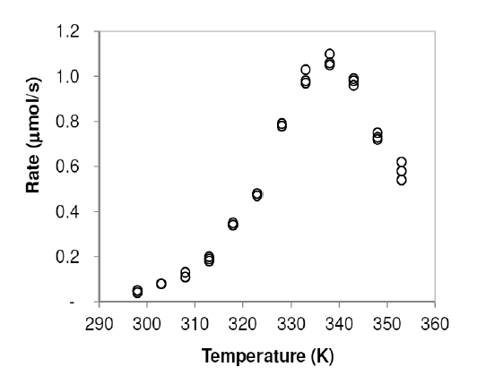
Enzymatic activity is known to be affected by temperature. A study examined the activity rate (in micromoles per second, μmol/s) of the digestive enzyme acid phosphatase in vitro at varying temperatures (measured in kelvins, K). The findings are displayed in the following table.
- Describe the relationship
- Explain why it doesn’t make sense to describe this as “positively associated” or “negatively associated”.
- Is this a strong or a weak relationship? Explain.
Solution
- The relationship increases with an upward curve from temperatures of 300K to 340K, when it turns downward sharply and decreases to 355K.
- The association is different for different X values. This is not a linear relationship, which means we have to do extra work to make sure that we cover all the non-linearities.
- This is a very strong relationship. The pattern clearly passes the facial impact test that we discussed before. It is far from a linear relationship, but it’s clearly noticable.
Again, always plot your data!!!
All of the plots in the Anscombe quartet have the same correlation coefficient.
\(r\) is a measure of linear association - if it’s not linear, \(r\) can’t be interpreted!!!
It’s important to note that \(r\) can always be calculated for numeric data. If we had student numbers as well as a categorical variable that used 0 to represent black, 1 to represent asian, etc., then we could technically calculate the correlation coefficient. This would be utterly meaningless!!!!!
Example: Penguins
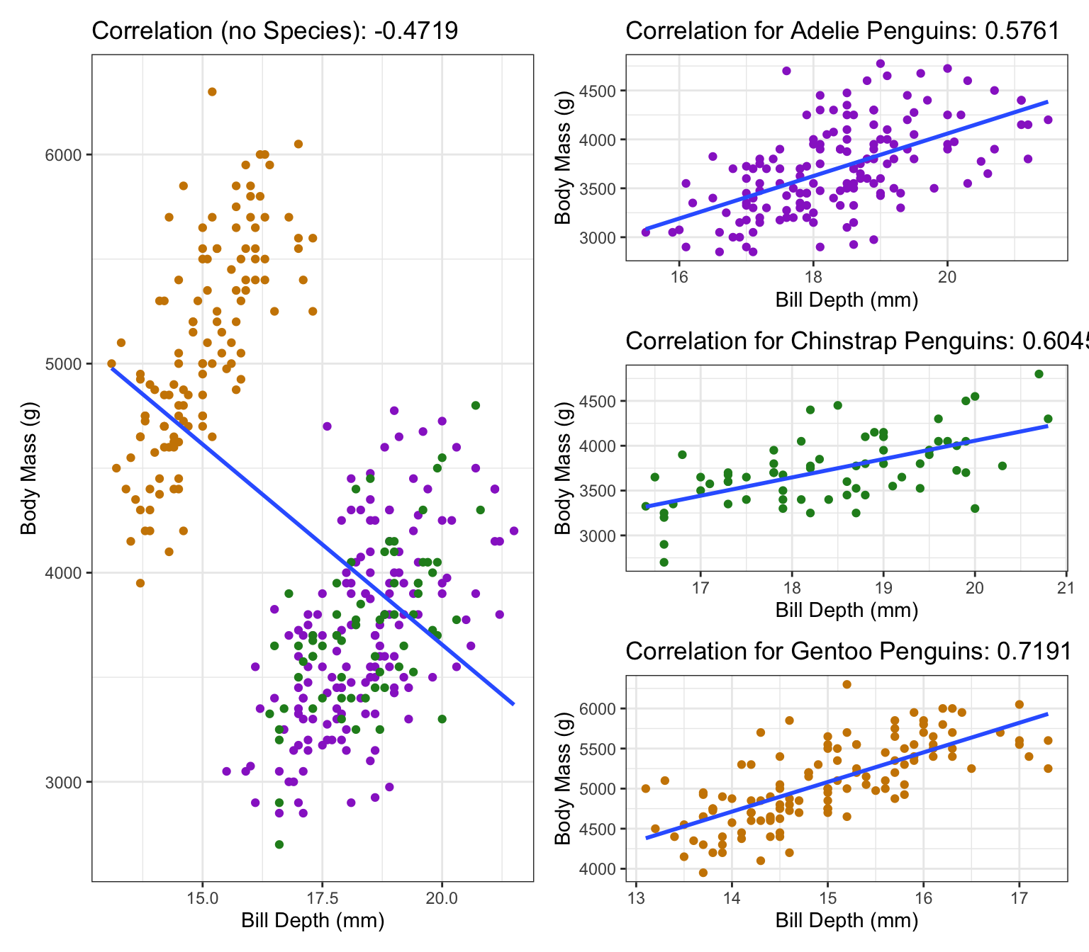
This is an example of something called Simpson’s Paradox: If we don’t account for the sub-groups, we get the opposite affect! As we can see in the plot, if we have all the groups together than it looks like a negative correlation (plot on the left), but once we separate groups each individual group has a positive correlation (plots on the right). In general, the conclusion that incorporates the most information is probably closest to the truth.
Correlation Summary
- \(r\) is a measure of linear association
- I’ve said it plenty, I’ll say it again: \(r\) does not apply to non-linear patterns!
- Always plot your data before calculating \(r\).
- \(r\) is like a measure of how two variables vary together.
- Formula is similar to the variance formula!
- \(r\) is a number between -1 and 1, with 0 meaning no correlation and 1 or -1 meaning perfect correlation.
- A negative \(r\) means a negative relationship (i.e. a line that goes down).
- Everything on the “Comments” slide is fair game for test questions.
Exercises:
- The following code will draw a plot and calculate the correlation coefficient. Currently, it’s doing this for the column
mpg(response) versus the columnwt(“weight”, explanatory) in themtcarsdata which is built in to R.- Re-run the code, but replace
wtwithdisp(engine displacement),hp(horsepower),drat(rear axle ratio, although I couldn’t explain this further), andqsec(quarter mile time, in seconds). Comment on the apparent pattern and the magnitude of the correlation. - Change
wttocyl, the number of cylinders. What do you notice about the plot, and how does this affect your interpretation of the correlation betweenmpgandcyl? Explain whycylmight be better incorporated as a categorical variable, even though it is indeed numeric. - Repeat part (b) for
am, which is “0” for automatic transmission and “1” for manual transmission.
- Re-run the code, but replace
plot(mpg ~ wt, data = mtcars)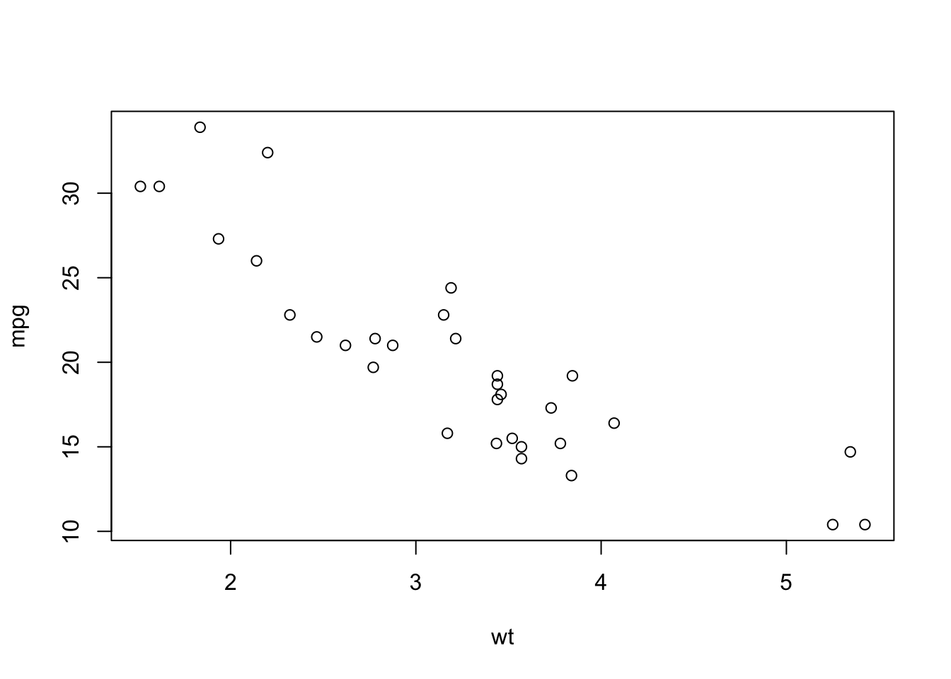
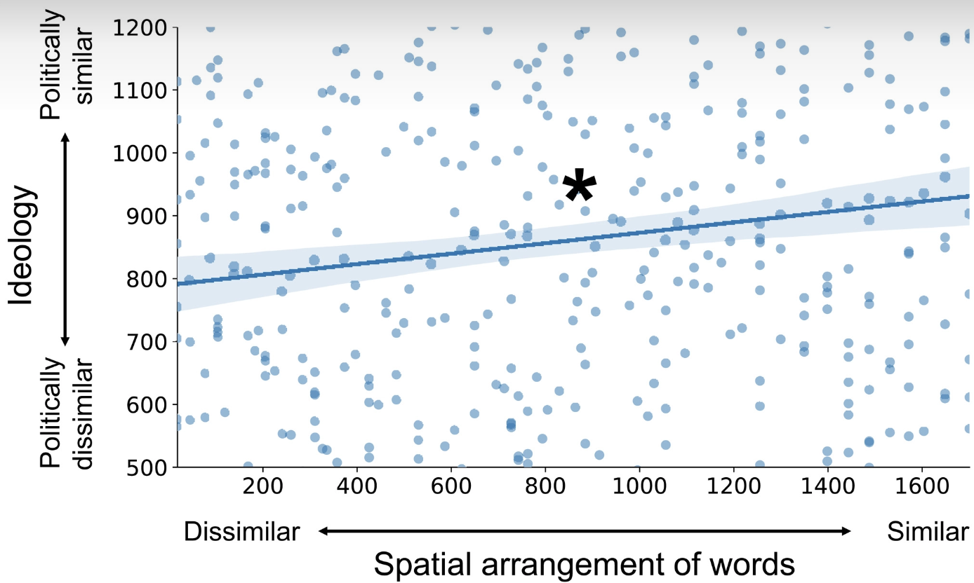
cor(mtcars$mpg, mtcars$wt)[1] -0.8676594- The following figure comes from the article “Shared neural representations and temporal segmentation of political content predict ideological similarity” by De Brujin et al., published in 2023 (link to aricle here). The star on the plot indicates that they have found a statistically significant relationship (more on this next week). Is this a strong correlation?
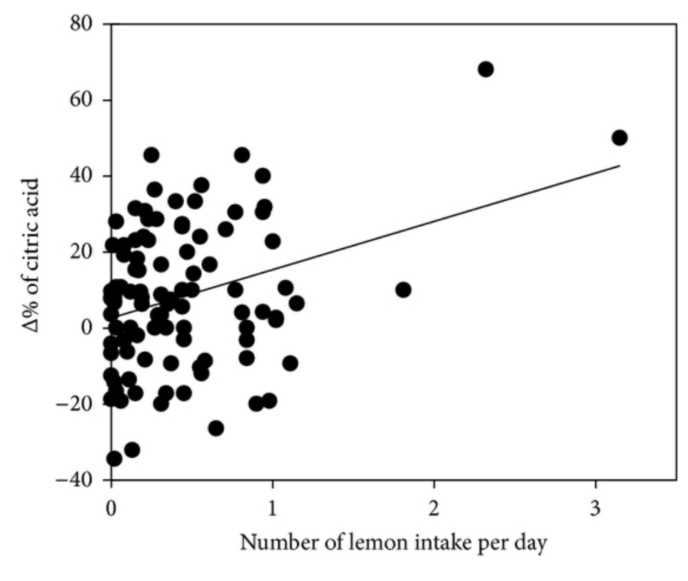
- The following figure comes from the article “Effect on Blood Pressure of Daily Lemon Ingestion and Walking” by Kato et al., published in 2013 (link to article here). Comment on the shape of this relationship. Recall how we described a “strong” shape as a shape that remains even if some of the data points were removed.
Exercises from OpenIntro Biotatistics textbook
Questions 1.35, 1.36, 1.37.
For further R practice and case studies, see the labs page for the OpenIntro textbook.
3.4 Crowdsourced Questions
The following questions are added from the Winter 2024 section of ST231 at Wilfrid Laurier University. The students submitted questions for bonus marks, and I have included them here (with permission, and possibly minor modifications).
- Consider a study investigating the relationship between the amount of time students spend studying for an exam (in hours) and their resulting exam scores (percentage). The study gathers data from 100 students, measures the two variables for each student, and plots these data points on a scatterplot. Which of the following statements best aligns with the principles of interpreting scatterplots and understanding relationships between variables as discussed in the course notes?
- If the scatterplot shows a clear upward trend, it proves that spending more time studying causes students to achieve higher exam scores.
- The study identifies the amount of time spent studying as the response variable and the exam score as the explanatory variable, predicting that higher exam scores explain why students spend more time studying.
- The scatterplot can help visualize the relationship between the two variables, but further analysis is required to determine if one variable causes changes in the other.
- A linear pattern in the scatterplot indicates that every additional hour of study leads to a uniform increase in exam scores for all students.
Solution
C is the correct answer. This option correctly acknowledges that while scatterplots are instrumental in visualizing the relationship between two variables (the amount of time spent studying and exam scores in this case), they alone cannot confirm causality. This aligns with the course’s emphasis on the distinction between correlation and causation and the role of scatterplots in identifying patterns rather than proving causation. Options A, B, and D either incorrectly assume causation from correlation, misidentify explanatory and response variables, or oversimplify the interpretation of a linear pattern, respectively.
- In an agricultural study, researchers are investigating the impact of different amounts of fertilizer (in kilograms) applied to tomato plants on the yield of tomatoes (in kilograms). Which of the following correctly identifies the explanatory and response variables?
- Explanatory variable: Yield of tomatoes; Response variable: Amount of fertilizer
- Explanatory variable: Amount of fertilizer; Response variable: Yield of tomatoes
- Both the amount of fertilizer and the yield of tomatoes are explanatory variables since they influence each other.
- Both the amount of fertilizer and the yield of tomatoes are response variables due to external factors like sunlight and water.
Solution
B is the correct answer. The amount of fertilizer is the explanatory variable because it is the variable being manipulated or controlled by the researchers to observe its effect on the yield of tomatoes, which is the response variable.
- A study plots the average daily temperature against the total daily sales of ice cream over a summer in a coastal city. The scatterplot shows a clear upward trend. What does this trend indicate about the relationship between these two variables?
- As the average daily temperature increases, the total daily sales of ice cream decrease.
- There is no relationship between the average daily temperature and the total daily sales of ice cream.
- As the average daily temperature increases, the total daily sales of ice cream also increase.
- The increase in average daily temperature causes an increase in the total daily sales of ice cream.
Solution
C is the correct answer. The upward trend in the scatterplot indicates that there is a positive relationship between the average daily temperature and the total daily sales of ice cream—meaning, as one increases, so does the other. However, it is important to note that this does not imply causation (which option D incorrectly suggests).
- In a study examining the relationship between hours spent on physical activity per week and overall quality of sleep, a correlation coefficient of -0.3 is found. Which of the following statements best interprets this finding?
- There is a strong negative relationship between hours spent on physical activity and quality of sleep.
- There is a weak negative relationship between hours spent on physical activity and quality of sleep, suggesting that as physical activity increases, quality of sleep slightly decreases.
- There is a weak positive relationship between hours spent on physical activity and quality of sleep.
- The correlation coefficient indicates that increased physical activity causes poorer quality of sleep.
Solution
B is the correct answer. A correlation coefficient of -0.3 indicates a weak negative relationship between the two variables. This means that as one variable increases (hours spent on physical activity), the other variable (quality of sleep) slightly decreases. However, it’s important to remember that correlation does not imply causation, making option D incorrect.
It is not true that a “larger” \(r\) means stronger relationship!↩︎
Comments on the correlation
\[ r = \frac{1}{n-1}\sum_{i=1}^n\left(\frac{x_i - \bar x}{s_x}\right)\left(\frac{y_i - \bar y}{s_y}\right) \]
Let’s explore some of these ideas with code!
It looks relatively linear. Take a moment to think of how correlated these two variables are, and assign it a value between 0 and 1. This is how you would guess the correlation coefficient
On exams, you will be expected to differentiate between “not correlated” (about 0), “slightly correlated” (0.2 to 0.4), “very correlated” (0.6 to 0.8), and “near perfect correlation (almost exactly 1)”, or the negatives of these values; you won’t need to guess whether the correlation is 0.55 or 0.6.
In R, we calculate the \(r\) with the
cor()function.Does this number make sense to you? It seems fairly high to me, but with small amounts of data it’s not that surprising. Think of it this way: if you removed a quarter of the data at random, would you still be able to see the pattern? If so, then it’s probably “very correlated”!
The first point states that the order doesn’t matter:
The units don’t matter:
However, it does matter if we do a non-linear transformation, such as squaring the values. The correlation is a measure of linear association, so making things non-linear will affect it.
For these data, squaring didn’t have much of an effect (as we can see in the plot), but we still saw a change in \(r\)! Notice that a unit change had absolutely no effect on \(r\). In general, we either expect things to be exactly the same or they can be completely different; very few things are “almost equal” in the general case (they may be almost equal with one set of data, but that means nothing for completely different sets of data).