The Hat Matrix
\[
H = X(X^TX)^{-1}X^T
\]
In R, we can calculate the diagonal of the hat matrix as follows:
Show the code
<- lm (mpg ~ disp + wt, data = mtcars)hatvalues (mylm) |> unname ()
 [1] 0.04339369 0.04550894 0.06309504 0.03877647 0.14078260 0.04406584
 [7] 0.11516157 0.09635365 0.09875274 0.11012510 0.11012510 0.08141444
[13] 0.04168379 0.04521644 0.17206264 0.19889125 0.19275897 0.08015728
[19] 0.12405357 0.09579747 0.05703451 0.06246825 0.05648077 0.06838477
[25] 0.14119998 0.08720679 0.07149742 0.16032953 0.18794989 0.05044456
[31] 0.04474121 0.07408572
Features of H
In the code below, I use the unname() function because mtcars has rownames which make the output harder to see (this used to be the norm in R, but it’s fallen out of fashion).
Show the code
[1] 1 1 1 1 1 1 1 1 1 1 1 1 1 1 1 1 1 1 1 1 1 1 1 1 1 1 1 1 1 1 1 1
Show the code
[1] 1 1 1 1 1 1 1 1 1 1 1 1 1 1 1 1 1 1 1 1 1 1 1 1 1 1 1 1 1 1 1 1
Show the code
range (H) # -1 <= h_{ij} <= 1
Show the code
range (diag (H)) # 0 <= h_{ii} <= 1
[1] 0.03877647 0.19889125
Show the code
%*% rep (1 , ncol (H)) # H1 = 1
                    [,1]
Mazda RX4              1
Mazda RX4 Wag          1
Datsun 710             1
Hornet 4 Drive         1
Hornet Sportabout      1
Valiant                1
Duster 360             1
Merc 240D              1
Merc 230               1
Merc 280               1
Merc 280C              1
Merc 450SE             1
Merc 450SL             1
Merc 450SLC            1
Cadillac Fleetwood     1
Lincoln Continental    1
Chrysler Imperial      1
Fiat 128               1
Honda Civic            1
Toyota Corolla         1
Toyota Corona          1
Dodge Challenger       1
AMC Javelin            1
Camaro Z28             1
Pontiac Firebird       1
Fiat X1-9              1
Porsche 914-2          1
Lotus Europa           1
Ford Pantera L         1
Ferrari Dino           1
Maserati Bora          1
Volvo 142E             1
The broom package
The broom package has a wonderful function called augment(). This function sets up our data so that it’s super easy to see what we need.
Show the code
library (broom)augment (mylm)
# A tibble: 32 × 10
   .rownames     mpg  disp    wt .fitted .resid   .hat .sigma .cooksd .std.resid
   <chr>       <dbl> <dbl> <dbl>   <dbl>  <dbl>  <dbl>  <dbl>   <dbl>      <dbl>
 1 Mazda RX4    21    160   2.62    23.3 -2.35  0.0434   2.93 0.0102      -0.822
 2 Mazda RX4 …  21    160   2.88    22.5 -1.49  0.0455   2.95 0.00435     -0.523
 3 Datsun 710   22.8  108   2.32    25.3 -2.47  0.0631   2.93 0.0172      -0.876
 4 Hornet 4 D…  21.4  258   3.22    19.6  1.79  0.0388   2.95 0.00524      0.624
 5 Hornet Spo…  18.7  360   3.44    17.1  1.65  0.141    2.95 0.0203       0.609
 6 Valiant      18.1  225   3.46    19.4 -1.28  0.0441   2.96 0.00309     -0.448
 7 Duster 360   14.3  360   3.57    16.6 -2.32  0.115    2.93 0.0309      -0.845
 8 Merc 240D    24.4  147.  3.19    21.7  2.73  0.0964   2.92 0.0344       0.984
 9 Merc 230     22.8  141.  3.15    21.9  0.890 0.0988   2.96 0.00378      0.322
10 Merc 280     19.2  168.  3.44    20.5 -1.26  0.110    2.96 0.00869     -0.459
# ℹ 22 more rows
Notice that it includes:
.fitted = \(X\underline{\hat\beta} = \hat Y\) .resid = \(\hat{\underline\epsilon}\) .hat = \(diag(H)\) .sigma = \(s_{(i)}\) .cooksd = D.std.resid = are these standardized or studentized residuals? Find out yourself as homework!!
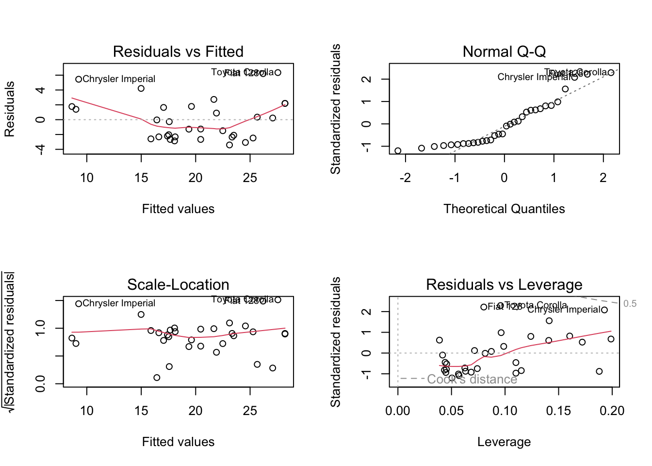
Plotting the residuals
If you’ve ever accidentally typed plot(mylm), you’ve seen some plots of the residuals.
Show the code
par (mfrow = c (2 , 2 )) # plot.lm produces four plots. plot (mylm) # ?plot.lm
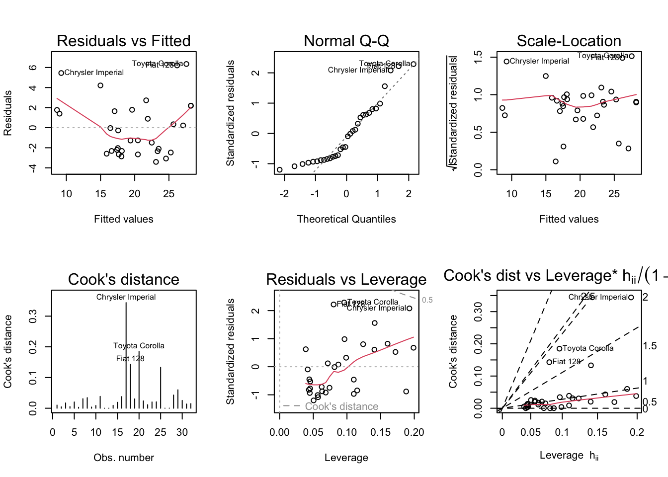
You can access individual plots with the which argument.
Show the code
par (mfrow = c (2 , 3 ))plot (mylm, which = 1 : 6 )
99% of the time, the default plots are the ones you’ll want to look at. For teaching purposes, we’ll look at the extra.
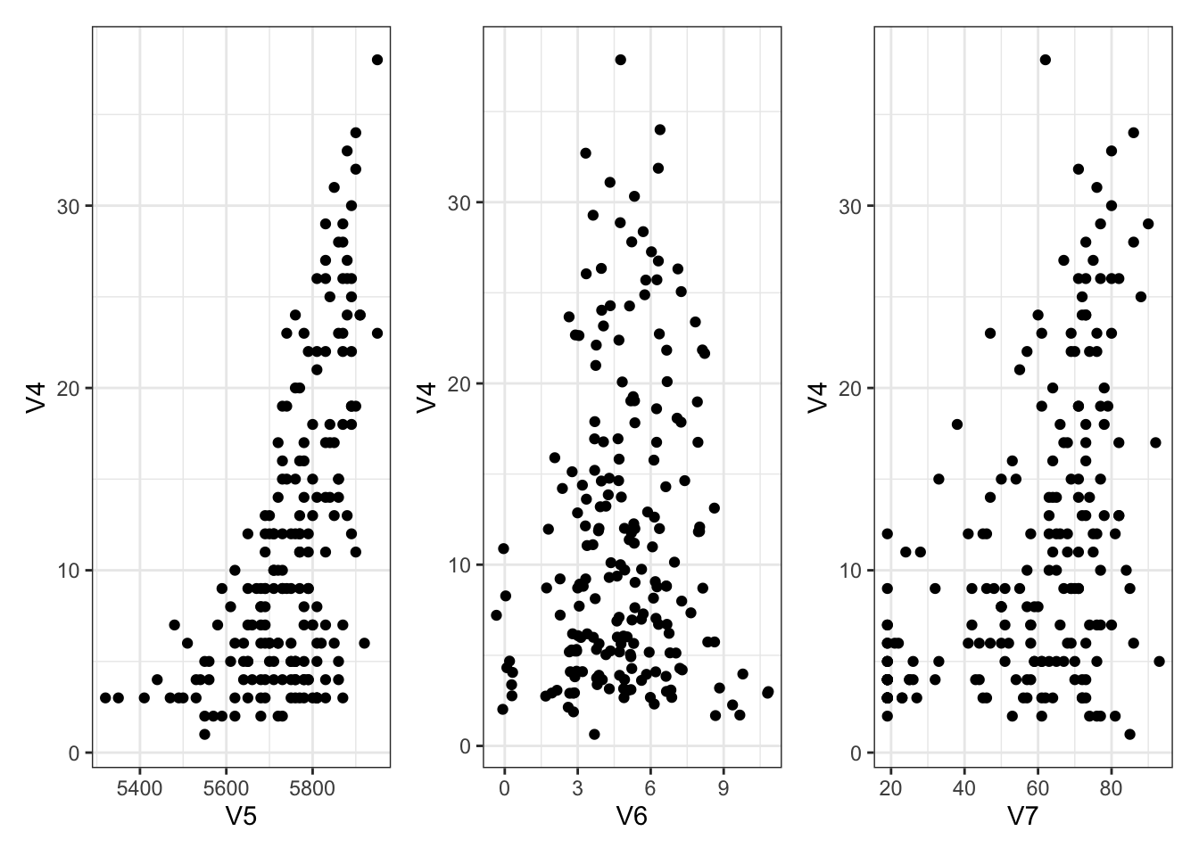
Demonstrations
We’ll use the Ozone data from the mlbench package.
V4 is response (measurement of Ozone)
V5 is atmospheric pressure
V6 is wind speed
V7 is humidity
We’ll ignore the rest.
Show the code
library (mlbench)data (Ozone)str (Ozone) # V4 is response (measurement of Ozone)
'data.frame':   366 obs. of  13 variables:
 $ V1 : Factor w/ 12 levels "1","2","3","4",..: 1 1 1 1 1 1 1 1 1 1 ...
 $ V2 : Factor w/ 31 levels "1","2","3","4",..: 1 2 3 4 5 6 7 8 9 10 ...
 $ V3 : Factor w/ 7 levels "1","2","3","4",..: 4 5 6 7 1 2 3 4 5 6 ...
 $ V4 : num  3 3 3 5 5 6 4 4 6 7 ...
 $ V5 : num  5480 5660 5710 5700 5760 5720 5790 5790 5700 5700 ...
 $ V6 : num  8 6 4 3 3 4 6 3 3 3 ...
 $ V7 : num  20 NA 28 37 51 69 19 25 73 59 ...
 $ V8 : num  NA 38 40 45 54 35 45 55 41 44 ...
 $ V9 : num  NA NA NA NA 45.3 ...
 $ V10: num  5000 NA 2693 590 1450 ...
 $ V11: num  -15 -14 -25 -24 25 15 -33 -28 23 -2 ...
 $ V12: num  30.6 NA 47.7 55 57 ...
 $ V13: num  200 300 250 100 60 60 100 250 120 120 ...
Show the code
<- Ozone[complete.cases (Ozone), ]
A small amount of exploration first:
Show the code
library (ggplot2)theme_set (theme_bw ())library (patchwork)<- ggplot (Ozone) + aes (x = V5, y = V4) + geom_point ()<- ggplot (Ozone) + aes (x = V6, y = V4) + geom_jitter () # deal with overlapping points <- ggplot (Ozone) + aes (x = V7, y = V4) + geom_point ()+ g6 + g7
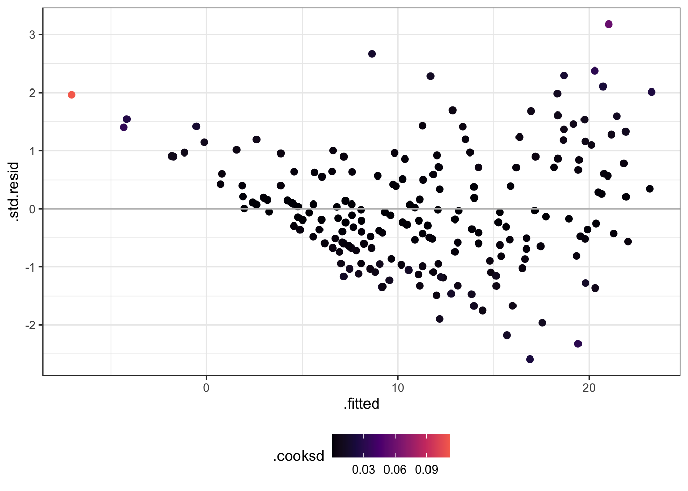
Now let’s check some residuals!
Change .resid to .std.resid.
Try rstudent(olm) as well.
Change .hat to .cooksd.
Show the code
library (dplyr)<- lm (V4 ~ V5 + V6 + V7, data = Ozone)augment (olm) %>% ggplot () + aes (x = .fitted, y = .std.resid, col = .cooksd) + scale_colour_viridis_c (option = 2 , end = 0.7 ) + theme (legend.position = "bottom" ) + geom_point (size = 2 ) + geom_hline (yintercept = 0 , colour = "grey" )
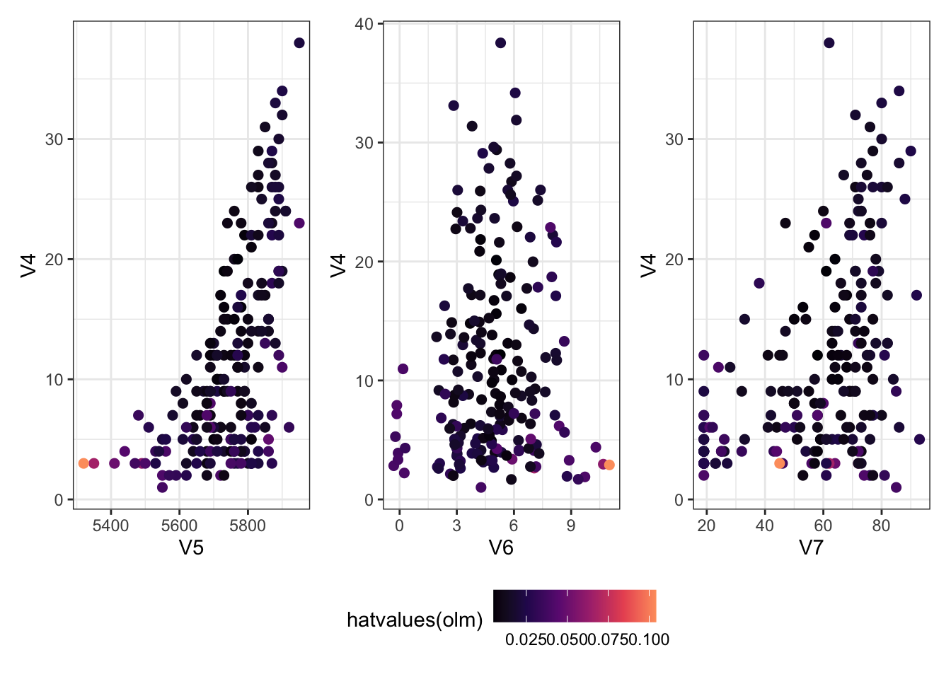
Which ones have a large hat value?
The plots below are the same as the ones above, but coloured according to the hat values.
Show the code
<- ggplot (Ozone) + aes (x = V5, y = V4, col = hatvalues (olm)) + geom_point (size = 2 )<- ggplot (Ozone) + aes (x = V6, y = V4, col = hatvalues (olm)) + geom_jitter (size = 2 ) # deal with overlapping points <- ggplot (Ozone) + aes (x = V7, y = V4, col = hatvalues (olm)) + geom_point (size = 2 )+ g6 + g7) + plot_layout (guides = "collect" ) & scale_colour_viridis_c (option = 2 , end = 0.8 ) & theme (legend.position = "bottom" )
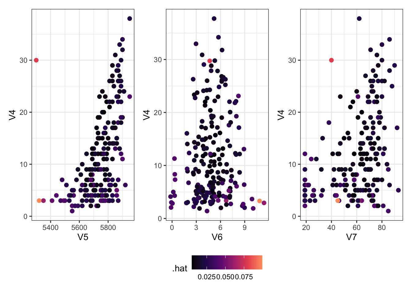
Adding an Outlier
Let’s add an outlier to see what happens with these data.
Show the code
<- Ozone[, c (4 : 7 )]<- rbind (newzone,data.frame (V4 = 30 , V5 = 5300 , V6 = 5 , V7 = 40 ))<- augment (lm (V4 ~ ., data = newzone))<- ggplot (newlm) + aes (x = V5, y = V4, col = .hat) + geom_point (size = 2 )<- ggplot (newlm) + aes (x = V6, y = V4, col = .hat) + geom_jitter (size = 2 ) # deal with overlapping points <- ggplot (newlm) + aes (x = V7, y = V4, col = .hat) + geom_point (size = 2 )+ g6 + g7) + plot_layout (guides = "collect" ) & scale_colour_viridis_c (option = 2 , end = 0.8 ) & theme (legend.position = "bottom" )
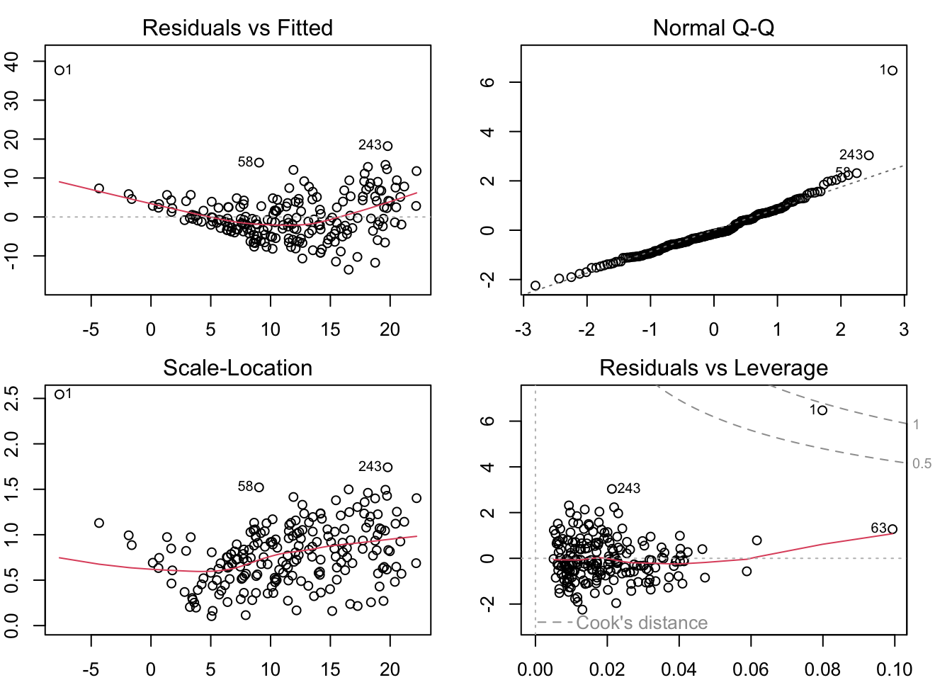
Using R’s Built-In Diagnostics
Show the code
par (mfrow = c (2 , 2 ), mar = rep (2 , 4 ))plot (lm (V4 ~ ., data = newzone))
Show the code
row.names (newzone) %in% c (1 , 58 , 243 ), ]
    V4   V5 V6 V7
58  23 5740  3 47
243 38 5950  5 62
1   30 5300  5 40
Huge residual!
This plot also just has a bad pattern
Deviates from normality!
Otherwise this looks pretty good.
Large standardized residual
Clear pattern without the outlier
Cook’s distance is massive compared to the others
Potentially some large \(D_i\) ’s
In the corner
Otherwise this looks okay-ish
Last plot also shows it as something different (harder to interpret)
What to do with a large residual?
Misrecorded: remove or fix, if possible
Fires with negative lengths (MDY versus DMY)
CO2 measured as -99 (code for NA in a system with no NA option)
Heights measured in the wrong units
Real, but large residual: Consider whether it’s actually part of the population of interest
Studying heights and got a basketball player in your sample? That’s a real data point and your model should allow for it!
Studying fish and a shark was included? That’s real, but maybe you should narrow your scope!
Many large outliers: you may need to try more predictors or a non-linear model.
DO NOT remove a point simply because it’s an outlier!!!